This dashboard provides visualizations to help administrators understand how users in their organization adopt Brightspace.
To see the Adoption Dashboard, your role must have the Can See Adoption Dashboard permission. Users will see aggregated data across the entire organization down to course level data for courses where they are enrolled. No user-level data is included in this dashboard.
The current Adoption Dashboard experience was released in Brightspace Platform July 2022/20.22.7 with an updated user interface, improved accessibility features, ability to filter data and interact with the cards, and a new visualization for tool usage by role.

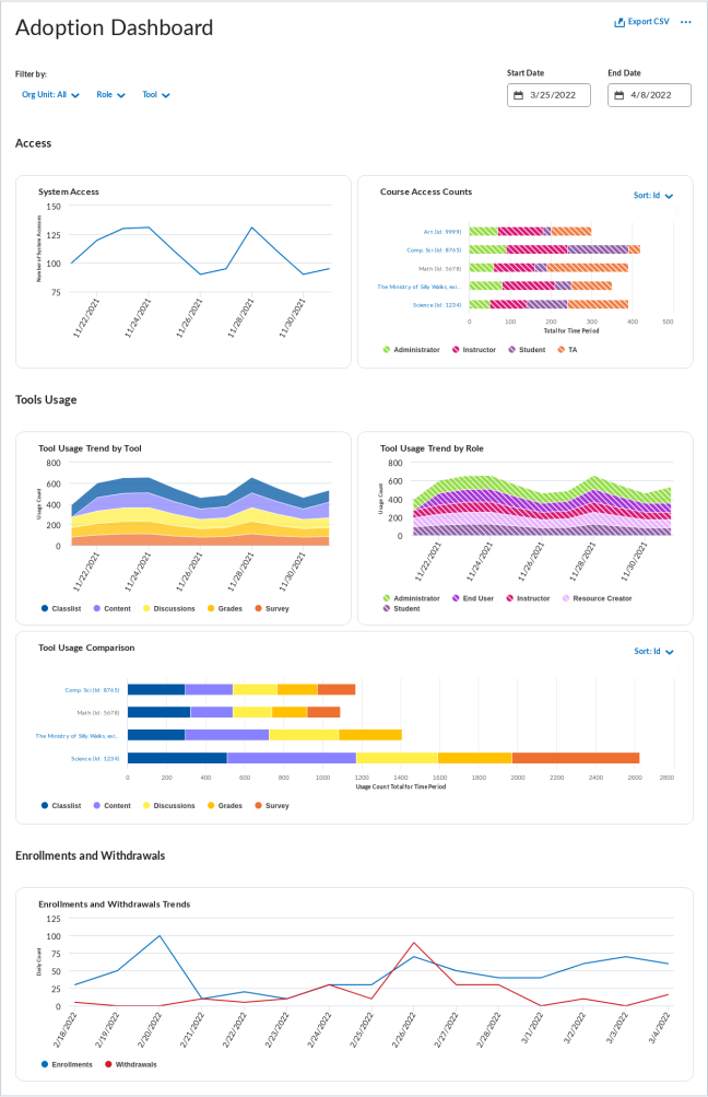
Figure: New Adoption Dashboard landing page, with "Export to CSV" button in the top right, filters for Org Unit, Role, Tool, Start Date, and End Date near the top, "Access" section, and "Tools Usage" section. Enrollment and Withdrawal section not pictured.
You can export the data from the dashboard by clicking Export to CSV on the top right of the dashboard. The filters you selected are respected and applied to the exported data.
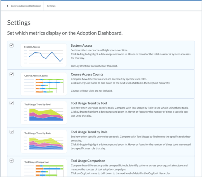
In the More Options (...) menu in the top right of the dashboard, click Settings to open the Settings page where you can find descriptions of the data presented in each cards and select which cards to display or hide on the dashboard.

Figure: The new Settings page, with all cards selected.
In the More Options (...) menu, click Learn More to navigate to the documentation about the data included in the dashboard.
Filters
The landing page by default displays visualizations combining data from your entire organization, with a date range of the most recent 2 weeks. Use the filters to narrow down the scope of the data to specific org units, roles, tools, and time periods that you are interested in. When you apply a filter, all charts adjust to display the corresponding filtered data. The filter drop-downs show the number of selections that are currently applied to the dashboard. Click Clear Filters to reset the dashboard to its original state.
The Org Unit filter allows you to isolate any portions of your organization that you have access to, with a maximum of 100 individual selections. All Tools and Roles are accessible in their respective filters. You can use the Date filter to look at different date ranges, with a maximum of 6 months at a time.
Each time you interact with the dashboard filters, the URL is updated. This means you can use your browser's Back button to go back one step and undo the selection you just made. You can also bookmark or share the URL to return to the same filtered view later.
Interacting with cards on the dashboard to drill down or zoom in to the data does not change the filters or the URL.
System Access
The System Access card displays a line graph of the number of system accesses on each day of the date range for all roles included in the filter. The Org Unit filter has no effect on this visualization because system access occurs at the organization level, not the individual course level. For more information about how we calculate System Access, refer to What is the new System Access metric and how do I use it? in Brightspace Community.
Interactions:
Course Access Counts
The Course Access Counts card displays a stacked bar chart showing how many times the courses under each org unit have been visited during the date range, with different colors representing the roles of the users accessing courses. By default, it displays the highest-level org units that are the direct children of the overall organization.
Interactions:
-
Click Sort in the top right corner of the card to change the order in which the data is presented. The default sorting method is Org Unit ID, low to high.
-
Click on an org unit in the chart to see the course access breakdown for the children of that org unit. Navigation breadcrumbs appear in the top left of the card to show your position in the org unit hierarchy.
-
You can continue drilling down through org units until you reach the course offering level. For example, if the highest-level org units at a school are the faculties, you can click Faculty of Science to see course access for all science departments, then you can click Physics Department to see course access for all physics course offerings. You cannot go deeper to compare different sections of the same course offering.
-
Click on a role in one of the bars in the chart to highlight all the data for that role and grey out all other roles. This also highlights that role in all other applicable cards on the dashboard and causes a Showing Only: tag to appear at the top of the dashboard.
-
Hover your cursor over a data point to highlight it and read its hover text.
Tool Usage Trend by Tool
The Tool Usage Trend by Tool card displays a stacked area graph of the number of times each tool was used on each day of the date range, with different colors representing different tools.
Interactions:
-
Click and drag to zoom into a shorter time period.
-
Click on a tool's area in the graph to highlight all the data for that tool and and grey out all other tools. This also highlights that tool in all other applicable cards on the dashboard and causes a Showing Only: tag to appear at the top of the dashboard.
-
Hover your cursor over a data point to highlight it and read its hover text.
Tool Usage Trend by Role
The Tool Usage Trend by Role card displays a stacked area graph of the number of tool uses on each day of the date range, with different colors representing the roles of the users using the tools. By providing information about how different user roles and org units are using the available tools, you can measure the success of adoption campaigns and the use of key tools.
Interactions:
-
Click and drag to zoom into a shorter time period.
-
Click on a role's area in the graph to highlight all the data for that role and grey out all other roles. This also highlights that role in all other applicable cards on the dashboard and causes a Showing Only: tag to appear at the top of the dashboard.
-
Hover your cursor over a data point to highlight it and read its hover text.
Tool Usage Comparison
The Tool Usage Comparison card displays a stacked bar chart showing how many times various tools have been used within each org unit during the date range, with different colors representing different tools. The visualization displays the highest-level org units by default.
Interactions:
-
Click Sort in the top right corner of the card to change the order in which the data is presented. The default sorting method is Org Unit ID, low to high.
-
Click on an org unit in the chart to see the course access breakdown for the children of that org unit. Navigation breadcrumbs appear in the top left of the card to show your position in the org unit hierarchy.
-
Click on a tool in one of the bars in the chart to highlight all the data for that tool and and grey out all other tools. This also highlights that tool in all other applicable cards on the dashboard and causes a Showing Only: tag to appear at the top of the dashboard.
-
Hover your cursor over a data point to highlight it and read its hover text.
Enrollments & Withdrawals
The Enrollments & Withdrawals card displays a line graph showing the number of enrollments and withdrawals during the date range within the selected org units, with separate lines for enrollments and withdrawals. The information on this visualization can help users understand patterns of course enrollments and withdrawals for both regular enrollment and rolling enrollments, and provide information about key dates such as semester start and the last day to drop a course. In addition, it can provide insight about spikes that may be due to other underlying issues. The Role filter has no impact on this card.
Interactions:
Note: On the Adoption Dashboard, a withdrawal is treated as an explicit un-enrollment from a course and does not reflect if a learner’s status is changed from active to inactive.