To reflect your organization's branding and improve the usability of the login widget for users, you can configure the following from the Login Page Management tool:
Headline
Use the headline to include a short introductory sentence and the name of your organization at the top of the login page.
You can also customize the color of the headline. By default, black (#000000) is the headline color.
Background Color
To reflect your organization's branding more, you can specify a background color for the login page. By default, the background color is transparent. To ensure that users can read all text on the login page, D2L recommends changing the default transparent background to a specific color.
To ensure Web Content Accessibility Guidelines (WCAG) Level AA compliance, the headline color picker and background color picker are linked. An icon and tooltip message in each color picker informs you if the color choices meet WCAG AA standards.
If you select the transparent background, the colors specified in the page theme display in the login page.
Message
The message displays below the headline. Use it to provide your users with additional information they may require.
Picture Widget
You can include one or more images to display in a widget beside the login area. If you include more than one image, the login page randomly selects an image to display in the widget each time a user accesses it. You can include a border around images.
Additional Content
Optionally, you can display content below the local login widget, above the footer. For example, you can include important information users should know before logging in. By default, the message box is empty.
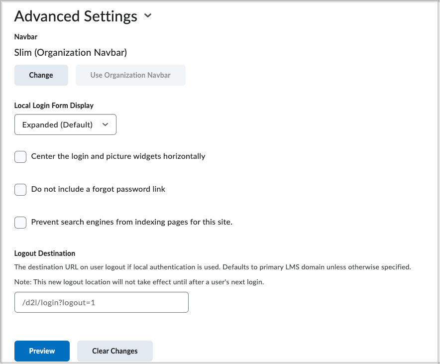
Advanced Settings:

Figure: Advanced Settings area of Login Page Management.
The navbar displays at the top of the login page, above the headline. You can customize the navbar's appearance, or use your organization's default navbar. Unlike the navbar that displays once you log in to Brightspace, the login page navbar displays without icons or links to tools.
You can choose to always expand, collapse, or hide the local login widget. By default, the login widget is expanded.
- Center the login and picture widgets horizontally
You can choose to center the local login and picture widgets horizontally. By default, the widgets are left aligned.
- Do not include a forgot password link
You can choose to remove the Forgot your password? link in the login area of the login page. Users can click the link if they need to reset their password.
- Prevent search engines from indexing pages for this site
You can choose to prevent search engines from indexing pages for your site. Turning this setting on adds a robots meta tag to D2L pages on your site.
You can choose a custom logout destination for users who are authenticated against the LE (who used LPM or a local login page to login). Users who logged in using an SSO solution still log out to the value configured in the SSO settings.
The new logout destination does not take effect until after a user’s next log in.
Note: If your organization has more than one active locale option, the login page displays a language selector that allows users to set one of the available languages as their default language for the login page. This language setting only applies to the login page. Changing the language does not change any custom text appearing on that page.