The course homepage is likely the first page your learners see when they land in your course. Therefore it’s important to design the homepage with purpose to enhance the course experience. The goal is to place useful information in intuitive places rather than create a cluttered homepage that causes your learners to struggle to find relevant links and information.
What’s a widget?
A widget is an application, or a component of an application, that displays specific information or provides a specific way for a user to interact with the learning environment. This is usually as a shortcut; for example, a quick link to the introduction of the first module.
How do I Edit my Homepage?
For more information on how to edit your homepage layout or the widgets on it, refer to the Manage widgets on your homepage topic.
Layout
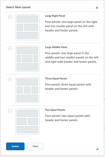
When designing a homepage, the first step is to decide what layout to use. Brightspace allows up to three columns worth of space for you to work with:
- A one-column layout is very similar to a typical web page design outside of Brightspace. It works well for things like banners, large visuals, and interactive or custom elements.
- The two-column layout is also very common. You have the option of splitting the page in half, or into a one-third and two-thirds layout. The two-column layout tends to be the most versatile while providing sufficient real estate for the content.
- The three-column layout is often used when trying to condense a lot of content into a single view. This gives a really crowded feeling, and in most cases, we recommend not using this layout, However, it might be applicable in some circumstances (for example, three similar lists of key dates, announcements, and resources).

Figure: Select a layout by clicking the corresponding radio button and then click Update.
When thinking about the layout, also consider how long the homepage is and how much scrolling is required. Minimal scrolling reduces cognitive effort, makes the content more digestible, and helps your users more easily find what they need. However, don’t sacrifice a bit of scrolling for a three-column homepage just so everything is in view when the user logs in.

|
Note: When D2L’s Learning and Creative Services team designs homepages, the basic layout is what is typically used. The large left panel and smaller right panel provides the right amount of space for the most commonly used widgets. |
Visual Styling and Organization
Most organizations add the Banner by default when a new course is created. It is recommended that you keep this widget to make a great first impression. Choose an image that suits your course content (D2L recommends an image size of 2400 by 960 pixels).
The Banner is also responsive!

Figure: An example of a Course Homepage Banner.
Keep in mind how a user scans the page. Regardless of cultural reading patterns, users typically start in the top left and work their way right and down as they catch relevant words, so put your most important information where learners scan first. The least looked at part of any web page is the bottom right.
Adding a course image banner that is not turned on by default
If your administrators do not configure the course image banner to be turned on by default, you may be able turn it on in the Course Offering Information page. You will need the Change Course Image and Banner Text permission enabled for your role to do so.
Course images are used for the My Courses Widget, the course image banner, and in Brightspace Pulse, and on all devices and screen resolutions. While the display size for the banner is 1170 by 200 pixels, it is recommended that the image you upload is 2400 by 960 pixels to ensure that the image you select displays clearly for all these scenarios. Images are automatically resized for the appropriate location and display.
- Navigate to Course Admin and select Course Offering Information.
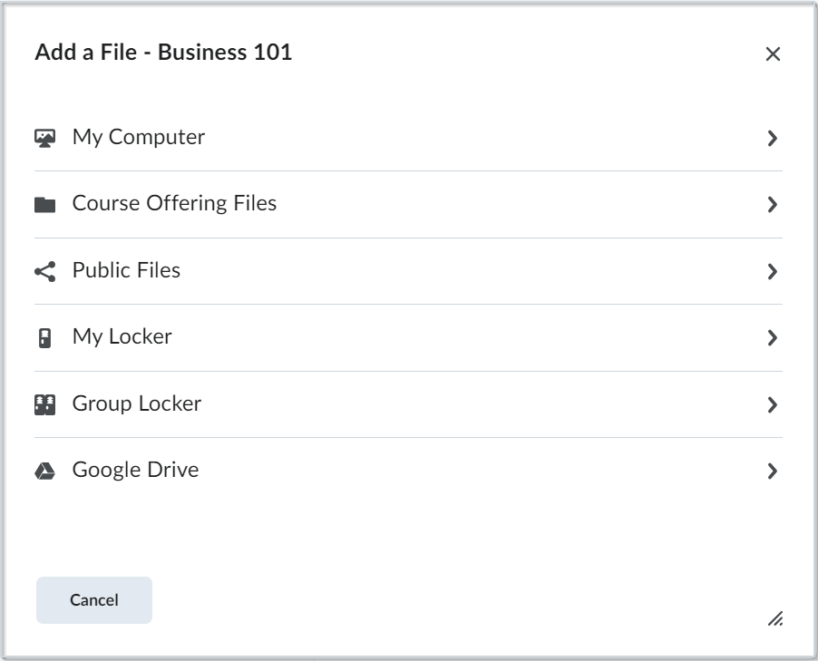
- Click Browse under the Course Image heading and select an option for the location of your image.

Figure: Click the desired location to search for your course image.
- Select your image.
- Select Display the image in a banner on the course homepage.
- Click Save.
Edit image titles on homepage banners
Instructors with the appropriate permissions can change the homepage banner image titles. The title can be changed to the Org Unit Name, a custom value (such as Hello {FirstName}) or the title can be deleted, and nothing displays in the banner.
- Hover over or press Tab to enter the homepage banner to see the Banner Settings menu.
- Click to open the menu and select Customize Banner Text.
- Do one of the following:
- Click Org Unit Name and enter or edit the name. This is the default that appears in the banner.
- Click Custom to enter a custom value (such as Hello {FirstName}). To view information about what other strings you can use, click the in-product help link.
- Click None to delete the current text and display no title on the banner.
- Click Save.
Choosing your Widgets
A useful homepage is one that provides the exact information a user needs when they need it. Well-designed homepages should enhance the learning experience rather than frustrate the user.
An effective homepage should include widgets to serve two purposes: navigation and communication.
Navigation
Provide
learners
with quick access to frequently used course features:

Figure: An example of how the Homepage provides quick access to course features.
- Use the Content Browser widget to allow quick access to modules and content topics. This takes the guesswork out of how to start learning.
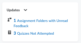
- The Updates widget is one that benefits both instructors and learners as it provides a snapshot of all work that requires attention. It can notify users of new feedback, quizzes not yet attempted, unread discussion posts, and new emails, among others.
- While it’s not a widget, also be selective about the links you have on the navbar and the order they appear in, from left to right (as per visual organization above).
- Are links in order of frequency or chronology of use?
- Are only those tools used in the course included?
- Are all links effectively and intuitively named?
 | Note: To improve the Accessibility of your layout and meet Accessibility benchmarks, we recommend that the text display of a link is the same as the link destination. |
Be sure to include Content, Grades (if this is a graded course), Class Progress, and whichever engagement and assessment tools you’re using (such as Quizzes or Assignments) at minimum.
Communication
Have a method to share up-to-date course information and just-in-time resources with your learners' Announcements or Activity Feed serve as useful tools for sharing updates, new resources, course reminders, and more with the whole class at once. It is recommended to choose one of these two tools as they have overlapping features. Activity Feed incorporates a social experience and allows learners to comment on posts while Announcements is your more traditional Instructor-to-Class notification tool.
Adding the Calendar widget is a great way to help learners to stay on top of due dates and other important course dates (such as drop deadlines, holidays, and more).

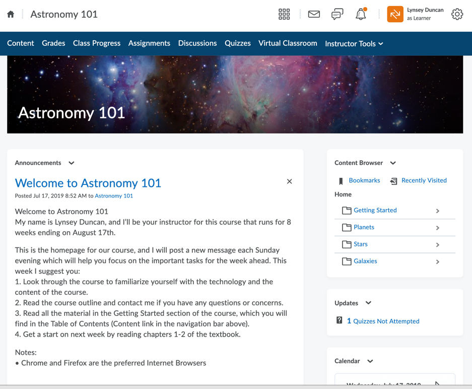
Figure: An example of a homepage that includes an announcement to communicate with users.
Pulling it all Together
How do you decide where to place different options on the page? Start with the navbar and decide what tools learners will access most frequently. We recommend Content be the first link.
If you opt for the two-column, basic layout, ensure your Banner is across the top. Place Announcements or Activity Feed in the left panel, so they are most visible each time a user logs in to your course. In the right panel, start with Content Browser then Updates and Calendar.
List of system widgets
System widgets are defined by the Brightspace platform. You cannot modify the contents of system widgets or delete them, but you can change where the widgets are located on your course homepage and customize their display options.
|
Widget
|
Description
|
|---|
| Access Google Workspace |
Allows users to access Google Workspace from the course homepage. |
| Activity Feed |
Provides a central location for instructors to post messages and assignments. You can also provide links to course materials and external resources. The Activity Feed tool can be configured to support student comments on posts as well as student-initiated posts.
|
|
Admin Tools
|
The Admin Tools widget displays all your available administrative links and provides easy access to the tools that you need to manage. The number of administrative links you can see in the Admin Tools widget is determined by your role’s permission settings in the Roles and Permissions tool.
|
| Announcements |
The Announcements widget communicates important updates and information to users. You can create Announcements items with formatted text, graphics, audio, and quicklinks. You can also choose the date range and conditions for an Announcements item's availability. |
| Auditors |
Provides users with an Auditor role who have alignments to students with access to view their cross-course User Progress view without requiring the auditor to be enrolled into courses. |
| Awards Leaderboard |
The Awards Leaderboard is a customizable system widget that can be added to the homepages of course offerings or any shared homepage. It displays the top 10 users who have earned badges (Awards) in the course. Course administrators can configure the Awards leaderboard to display the learners with either the highest Number of Awards or Credits appearing at the top. Learners with the same number of awards/credits falling within the top 10 grouping are sorted by name in alphabetical order.
|
|
Bookmarks
|
This widget is used to bookmark pages in course content. The bookmark widget is typically located on course offering homepages.
|
|
Calendar
|
The Calendar widget consists of a mini-calendar and a list of upcoming events. It displays all events created by instructors and administrators for the applicable month. Clicking on a day in the widget's mini-Calendar filters the event list to only display events for that day. Clicking on an event in the widget takes you to the event in the Calendar tool.
|
|
Capture
|
The Capture widget enables you to access the recording and presentation functions of Brightspace Capture Encoder and provides direct links to all Capture presentations in a course to learners.
|
|
Content Browser
|
The Content Browser widget enables you to browse course content, view recently visited topics, and view bookmarked topics from your course homepage. You can access your recently viewed and bookmarked topics from the content browser home and use the drill-down menu to navigate course content topics and modules. As you navigate deeper into content modules, the navigation at the top enables you to move up one module level or jump backwards to the Content Browser home. To view a topic, click on its name to launch it in View Content. The Content Browser widget retains the place you left off when you return to your course homepage.
|
| Content Navigator Widget |
Displays modules in Content and shows the user's progress for each module. |
|
Course Administration
|
The Course Administration widget displays links to your course administration tools. The number of links you can see in the Course Administration widget is determined by your role’s permissions in the Roles and Permissions tool.
|
|
Google Search
|
The Google Search widget enables you to search the web from your homepage. Your search results open in a new window using your default internet browser.
|
| Google Workspace |
Displays your Google Workspace and the content within it. |
| Kaltura |
Adds the Kaltura integration to your homepage: a scalable video cloud platform. |
| Learner Awards Widget |
Displays all possible learner awards on your homepage. Learners can see their own awards and the available awards within your course. |
| Learning Repository |
Allows you to search your Learning Repository (LOR) from your course homepage. |
| Multi-Profile Widget |
Allows creation of multiple course-supporting roles within a single widget and retrieves user information from User Profiles and the Classlist to display a list of users in the course and their roles to learners. |
|
My Courses
|
The My Courses widget shows course offerings in which users are enrolled and can access. Users can pin courses in the widget and navigate to course homepages by clicking the course tiles. Pinned course tiles display notifications for unevaluated assignment submissions and quizzes, and unread discussion posts.
|
| My Org Units |
Displays all your org units within your organization in Brightspace. |
|
My Settings
|
The My Settings widget only displays links the user has permission to view. These permissions are located under Account Settings in the Roles and Permissions tool.
|
|
Microsoft 365
|
The Microsoft 365 widget allows you to log in to your Microsoft 365 account by entering your credentials. When you log in, the widget displays a list of your emails, calendar events, and OneDrive documents. Clicking anywhere in the widget takes you directly to your email, calendar, or OneDrive, depending on which tab you're on. Navigating to an individual email, calendar event, or OneDrive document within the widget is currently not supported.
|
| Photo Banner Widget |
Displays uploaded images in a carousel. Users with permissions can upload images, add a link to the carousel, and customize the background styling of the widget. Users with the appropriate permissions can also add or remove images and configure the background. |
| Quick Eval |
Shows all the activities in your course that require assessment. |
|
Role Switch
|
The Role Switch widget enables you to temporarily switch your active role to another role in your organization by selecting it from a drop-down list. You can then navigate the org unit based on the permissions of another role without having to log out and log in as another user. For example, you can select another role to see how Course Home or a quiz appears to users in that role.
|
| Single Card Profile Widget |
provides in-line authoring that allows instructors, facilitators, tutors, and other users to introduce themselves to learners. Put important details at the forefront, showcase your photo, share social media details, and write other important bio information. |
| Slim Announcements Widget |
Presents you and your learners with a simplified, shorter view of announcements. |
|
Tasks
|
The Tasks widget enables you to view and manage tasks from the Calendar tool. You can add a due date and additional notes to each task, and the system sorts them into the categories of Today, Upcoming, or Someday (no due date).
If you mark a task complete, it disappears from the list. However, you can click the View Completed Tasks link to review the tasks you've finished.
|
|
Updates
|
The Updates widget can be configured to display any of the following links:
- Unread submission files
- Unevaluated assignment submissions
- Unread discussions posts
- New email
- Ungraded quizzes
- Quizzes that have not been attempted
- Self-registration updates
The Updates widget can only be configured or updated by a D2L Implementation Services Specialist or D2L Support. Please contact D2L Support if you want to customize the links displayed.
|
|
User Links
|
The User Links widget allows users to create a personal list of links to external websites.
|
| Visual Table of Contents Widget |
Displays a ‘flip tile’ visual representation of modules in a course. Learners can click on each tile to flip it over and reveal a description of the module. |
| Welcome Window Widget |
Displays a pop-up message the first time a user logs into a course. This message can include text, images, and even short videos. |
| Work To Do |
The Work To Do widget provides learners with a summary of their assigned learning activities that are overdue or have an upcoming due date or end date across all their courses (when added to the Organization homepage). If the Work To Do widget appears on a course homepage, the summary of learning activities only applies to the specific course. |
Custom Widgets
You can also create your own custom widgets, to serve additional needs that the standard widgets don’t cover, such as a profile widget with your contact information.
For additional information, refer to the Create a custom widget heading of the Manage widgets on your homepage topic.