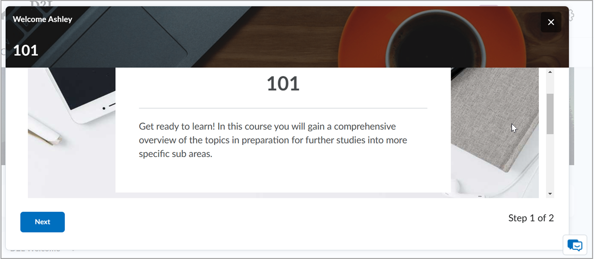
The Welcome Window widget displays content from a module you specify and can include a short introduction, button text, and a background image. The window appears on the homepage after you configure it. It appears again for a user when you add new content to the welcome module, even if they previously dismissed it. Learners can open it again from the widget button on the homepage.

|
Note: The Welcome Window widget is designed to present when the welcome module changes. If you update that module frequently, learners may experience the window repeatedly. |
Prerequisites
- You have the required Welcome Widget role permissions to customize the widget (ask your administrator if unsure).
- You’ve created a welcome module in Content that contains the information you want to display. The widget does not appear if no welcome module (or no content within it) exists.
Configure the Welcome Window widget

|
Before you begin: Create the content for the Welcome Window widget in the Content tool by setting up an introduction or welcome module with the course resources you want to present to users. The widget displays this content once you enter the module title during configuration. The Welcome Window widget does not appear if no welcome module or content within a welcome module exists.
|
Customize the Welcome Window widget's appearance to users by changing settings on the Configure Widget form.
To customize the Welcome Window widget
- From your course homepage, navigate to the Welcome Window widget.
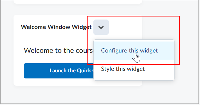
- On the Welcome Window widget, click the Actions for Welcome Widget drop-down menu (arrow)and select Configure this widget.
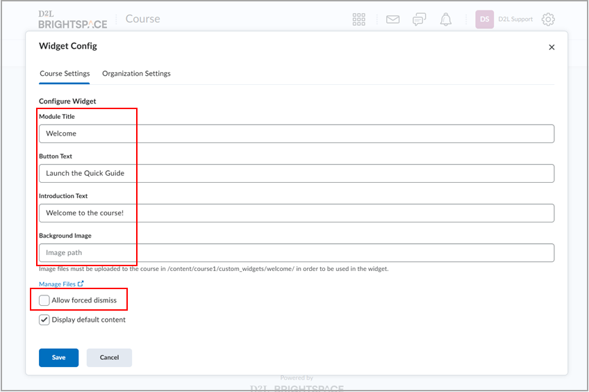
- On the Widget Config form, Choose Course settings (this course only) or Organization settings (all courses).
- Enter the following values:
- Module Title. Enter the name or a keyword from the title of the content module that will populate the content of the widget.
- Button Text. Add the text that appears on the Welcome Window widget button to display the widget content when clicked.
- Introduction Text. Enter a sentence to appear in the widget.
- Background Image. You can enter a file path to an image you want to appear in the widget background. Image files must be uploaded to the course folder in Manage Files.
- Select Allow forced dismiss to prevent users from closing the dialog window without dismissing it.
- Select Display default content to retain the default instructional content for instructors.
- Click Save.
After configuring the widget, the window appears to users the next time they arrive at the homepage. Any time new content is added to the welcome module, the widget reappears to users again, even if it was previously dismissed. Users can view the window again after dismissing it by clicking the corresponding button in the widget on the homepage.
|
Note: If a Welcome Window widget has no available data, you see an illustration and a clear message that no data is available yet. |