The Homepage Widget Expansion Pack offers a catalog of homepage system widgets to provide a more customized learning experience for your homepages.

|
Note: System widgets are available for purchase individually or in packages of three, as an add-on to your Brightspace product plan. Some may have been included in your implementation package. Refer to Add widgets to your homepage for details about how to locate and add widgets to your organization or course homepage. |
Awards Leaderboard Widget
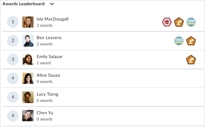
The Awards Leaderboard widget creates a fun and competitive environment where learners can show off their digital badges. Learners can see how they compare to their peers, motivating them to pursue more badges in your course.
The Awards Leaderboard displays the top ten learners who have earned badges (not certificates) in your course. Your course administrator can configure the Awards Leaderboard to display learners with either the highest number of awards or highest number of credits at the top. Learners with the same number of awards falling within the top ten grouping are sorted by name in alphabetical order.

|
Note: Learner names may appear as Anonymous User if their role is restricted from seeing first and last names via the User Information Privacy settings. A learner's preferred name setting may appear if enabled for them. For more information about how to create Awards that are displayed by the Awards Leaderboard widget, refer to Create and manage awards. |
Content Navigator Widget
The Content Navigator widget is a streamlined widget that gives learners quick access to course topics. Learners can select to move from module, to sub-module, to content for more direct access. This widget tracks and displays navigational history and allows one-click navigation to the last-visited module topic. The Content Navigator is useful when:
- Your course homepage has another focal widget and you want to contain and collapse a lot of information without taking up too much space.
- Your course does not follow a linear progression and you want to provide more direct access to content that matters to learners.
- Your course is not a course and you are using a Brightspace course as a repository for information, resources, and activities. Learners can target content they need right from the homepage.
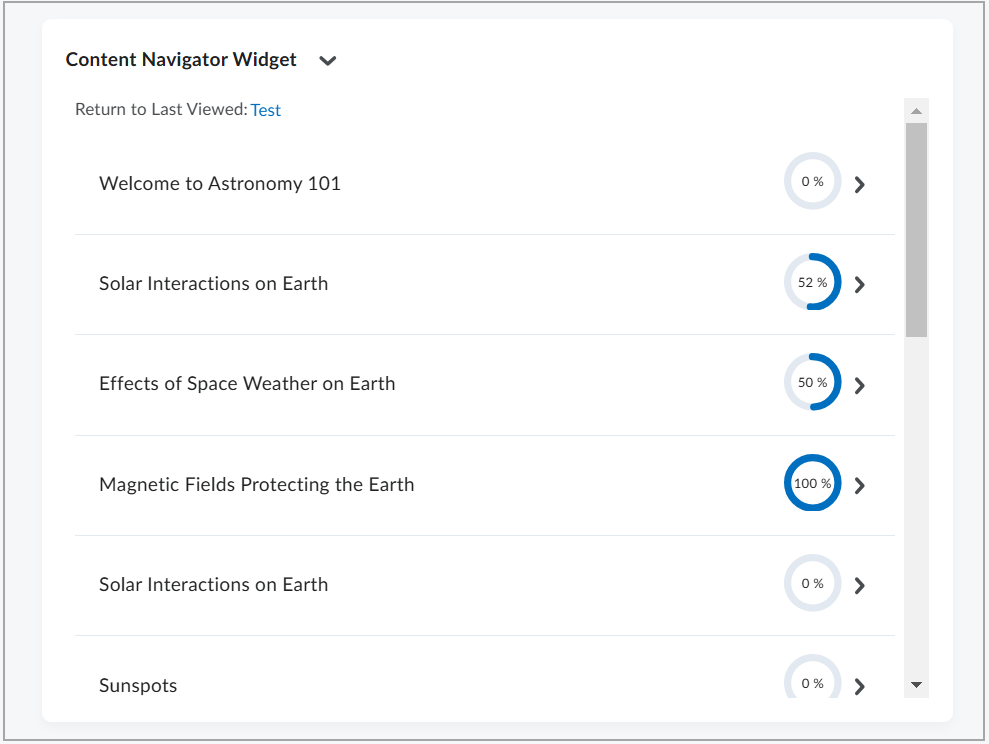
Figure: From the Content Navigator Widget, view course topics with progress indicators. Click Return to Last Viewed to reopen the last accessed content.
The Content Navigator widget can be customized to display icons to the left of Content Topic titles. Icons can be enabled at both the organization and course levels.
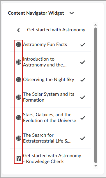
To enable icons at the organization level:
- From the course homepage, click the down arrow beside Content Navigator Widget and select Configure this widget.
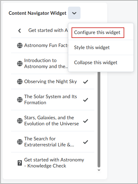
- In the Widget Config dialog box, click the Organization Settings tab.

- Click Display Menu Item Icon to enable icons for all widgets on the site.
- Click Save.
To enable icons at the course level:
- From the course homepage, click the down arrow beside Content Navigator Widget and select Configure this widget.

- From the Course Settings tab, click Display Menu Item Icon to enable icons for the course.

- Click Save.

|
Note: To experience widget behavior enabled by configurations, your administrator must grant the following permissions:
- Retrieve Org Unit Custom Widget Data
To configure and modify the Content Navigator Widget, your administrator must grant the following permissions:
- Homepages > Retrieve Org Unit Custom Widget Data
- Homepages > Modify Org Unit Custom Widget Data
The widget uses topic completion status to determine module completion. If a topic uses Manual completion, it counts as complete as soon as you mark it complete in the Content tool .
|
Learner Awards Widget
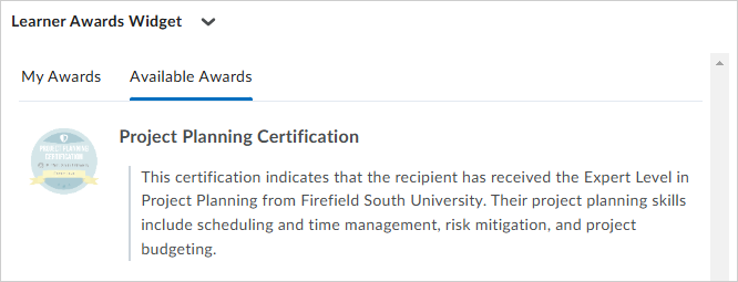
The Learner Awards widget is a system widget that can be added to the homepages of course offerings, if enabled for your organization. It shows the badges that a learner has earned and the badges that are still available to be earned. Learners can gauge their progress and push themselves to earn all the badges.
Multi-Profile Widget
The Multi-Profile widget allows you to introduce yourself to your learners. You can also use the widget to introduce other teaching assistants or facilitators in your course. The system widget retrieves user information from User Profiles and the Classlist to display a list of users in the course and their roles to learners.
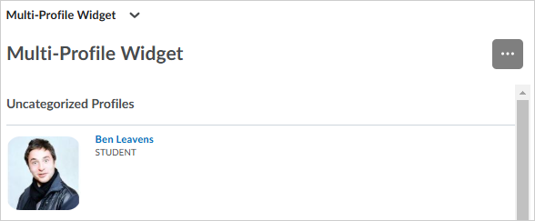
Photo Banner Widget
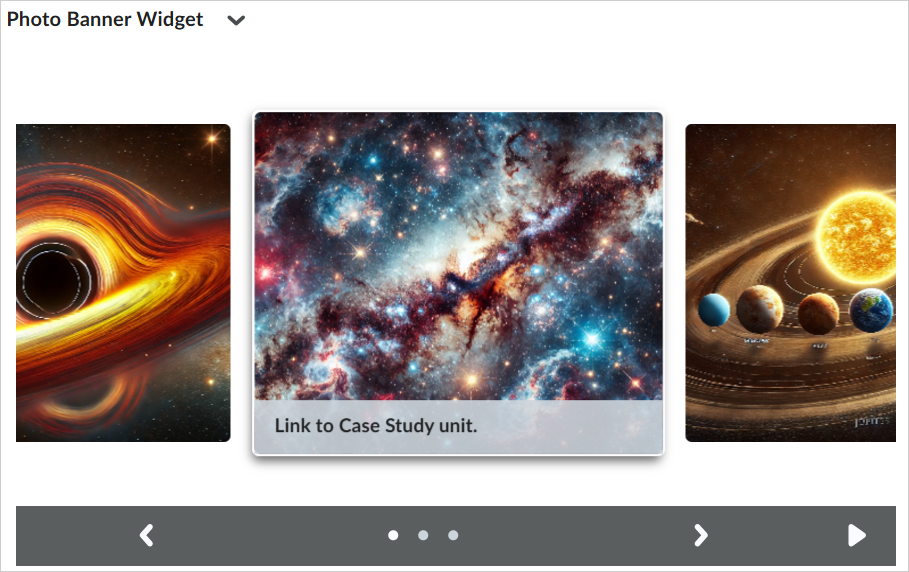
The Photo Banner widget is a customizable, course-level widget that displays uploaded images as a gallery. Users can upload images, add a link to an image, and customize the background styling of the widget.
The Photo Banner widget is useful when:
- You have image-heavy content.
- You want to highlight scheduled content.
- Your course relies significantly on image-based content for learning.
- You ask your learners to collect images and you want to curate their work.
- You want to have visuals to support learning.
- You want to post in-class moments of exploration, collaboration, and discovery.
Single Profile Widget
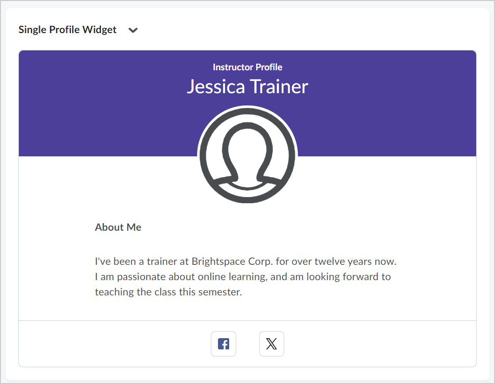
The Single Profile Widget provides in-line authoring that allows instructors, facilitators, tutors, and other users to introduce themselves to learners. Put important details at the forefront, showcase your photo, share social media details, and write other important bio information. Users with the appropriate permissions can upload a photo, add a brief biography, and provide links to social media profiles.

|
Note: This widget is intended for instructors who may not otherwise have the permissions to modify course homepages. Editors can change the content of each field from the homepage itself; fields that are empty do not display in the widget. To learn more about using the Single Profile Widget, refer to Using the Single Profile Widget. |
Slim Announcements Widget
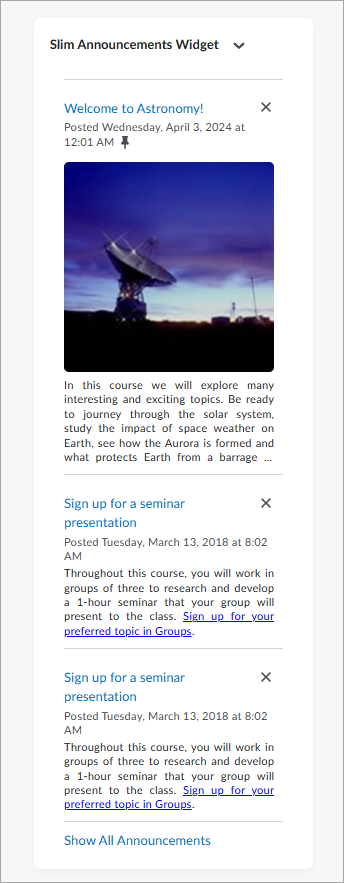
The Slim Announcements widget offers a simplified, shortened view of announcements. This widget is great for when you have a lot to say – you can share as much as you want without sacrificing the visual design. Use the Slim Announcements widget to set default images, display a maximum number of announcements, and choose to display pinned announcements.
Visual Table of Contents (TOC) Widget
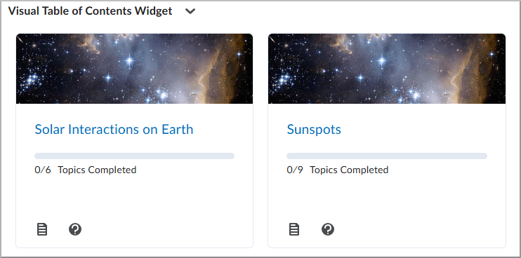
The Visual Table of Contents (TOC) widget displays a visual representation of modules in a course. Each course module can be set to show an image, title, module description, and progress meter. Learners can click on the Show Description icon (?) to open a detailed description of the module in a new dialog.

|
Note: Module descriptions in the Visual TOC widget reflect the module descriptions set in the Content tool. If a course module description includes an image, the widget displays it as the module image; otherwise, it uses the course image. To learn more about using the Visual TOC widget, refer to Using the Visual Table of Contents (TOC) Widget. |
The Visual TOC widget also acts as a progress tracker, displaying the number of topics learners have completed out of the total available. The widget also tracks where a learner left off, so they can select the module title to get to the top level of the module or select the Next Topic button to go to the next unread topic in that module.
Use this widget when:
- You have a content-driven course. The Visual TOC widget adds a highly visual, simplified organization system right on your homepage.
- You have a traditional linear course structure.
- You want to promote learner progress by visualizing progress and reinforcing the importance of completion.
Welcome Window Widget
The Welcome Window widget displays a pop-up message to users when they log in to a course for the first time. This message can include text, images, and short videos. Course creators and administrators can easily edit and update the content in the pop-up message, and you can include as many pages in the pop-up window as you need. The Welcome Window widget is designed to welcome users, help orient them to the structure and navigation of the course, and set them up for success.
Use this widget when:
- You want to give an orientation about Brightspace to new users.
- Your learners are new to your course or program. You can discuss policies, assessments, opportunities, and requirements.
- You have an important change or announcement you want users to know about.
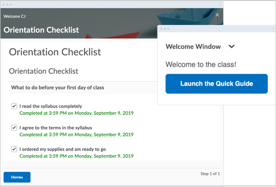
Figure: A customized Welcome Window widget displays an orientation checklist for learners.