Use Creator+ Insert Element to add dynamic components to your content without writing HTML. You can use Insert Element to create accordions, tabs, click and reveal elements, callouts, timelines, stylized quotes, flip cards, carousels, and hotspots.

|
Note: Insert Element and Practices support the file language attribute so you can build content in the language of your choice. The language you set appears in content, on buttons that expand content, when viewing solutions and scores in Practices, and in ARIA labels. To use the language attribute in content, ensure that d2l.Tools.Content.ApplyPageLangAttribute is set. |
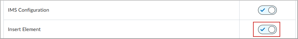
To turn on Elements
- To open Organization Tools, navigate to Admin Tools > Organization Tools.
- Scroll down the tools list to Insert Element.
- To enable the tool, turn the Availability toggle to On.
|
Note: You do not need permissions to use Insert Element; however, access to all Creator+ tools is controlled by the d2l.Tools.CreatorPlus.IsEnabled configuration variable. Contact your administrator for help. |
Insert accordions
Use Insert Element to add an Accordion to your content. Accordions are useful when you want to present a list of items with additional details for each item. This structure helps learners focus on the main ideas first and then expand each section for more information.
To insert an accordion
- In the Content tool, create a new topic or edit an existing topic.
- Click Creator+ Authoring Tools, and then select Insert Element.
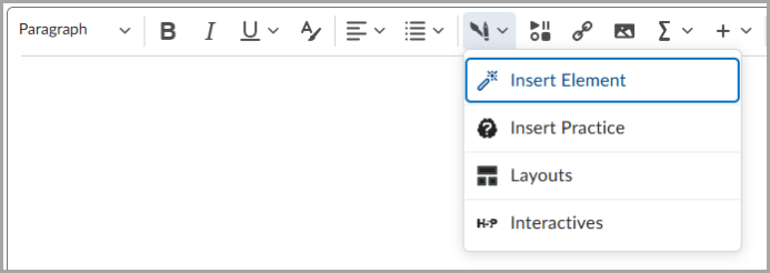
- Click Accordion.
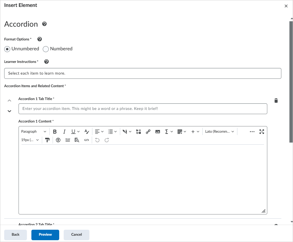
- Select one of the Format Options to indicate if you want to number the accordion folders.
- To help learners use the element, enter text in Learner Instructions.
- To add accordion content, enter an Accordion Tab Title and Accordion Content for each accordion item.
- To add another accordion item, click + Add Accordion Item.
- To review and add the element, click Preview, and then click Insert.
The Accordion element is added to your content.
Insert tabs
Use Insert Element to add Tabs to your content. Tabs are useful for presenting related information in a series, such as the hypothesis, method, and findings of a scientific study.
To insert tabs
- In the Content tool, create a new topic or edit an existing topic.
- Click Creator+ Authoring Tools, and then select Insert Element.
- Click Tabs.
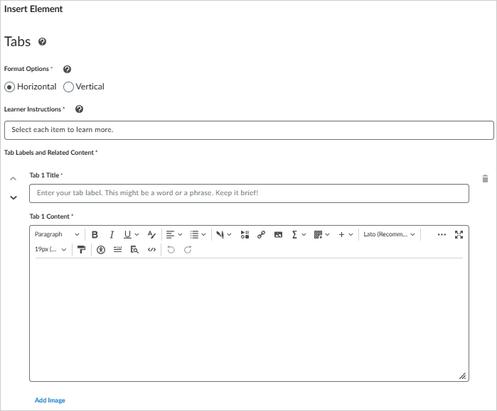
- To set the tab layout, select one of the Format Options for horizontal or vertical tabs.
- To help learners use the element, enter text in Learner Instructions.
- To add tab content, enter a Tab Title and Tab Content for the first tab.
- To add another tab, click Add Tab Item.
- To review and add the element, click Preview, and then click Insert.
The Tabs element is added to your content.
Insert a click and reveal element
Use Insert Element to add Click and Reveal elements to your content. Click and reveal elements encourage learners to reflect on a question, statement, or fact before revealing supporting information. You can also use them to provide optional learning materials.
To insert a click and reveal element
- In the Content tool, create a new topic or edit an existing topic.
- Click Creator+ Authoring Tools, and then select Insert Element.
- Click Click and Reveal.
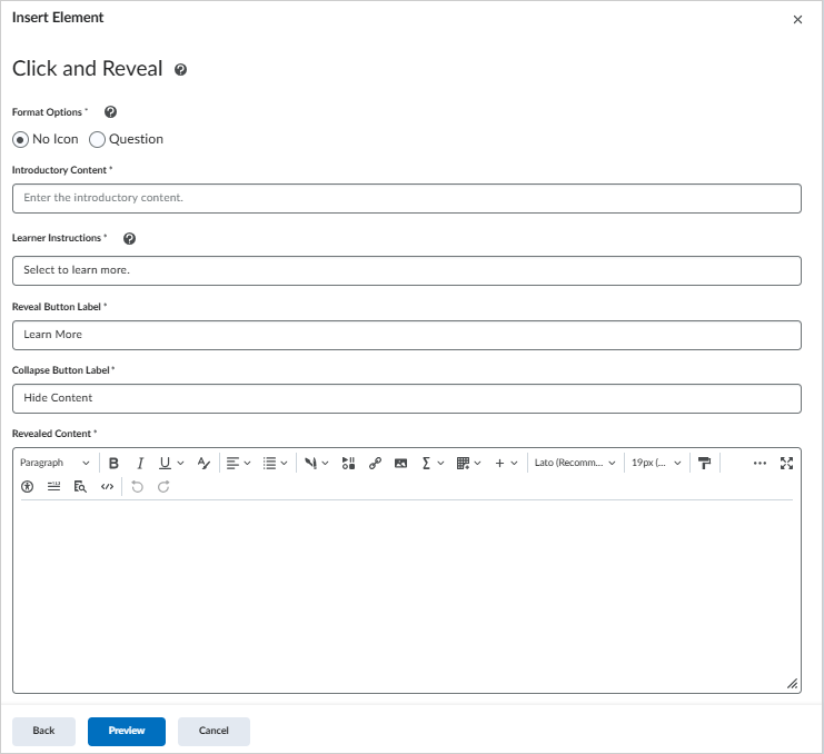
- To set the display style, select one of the Format Options.
- To introduce the element, enter text in Introductory Content.
- To help learners use the element, enter text in Learner Instructions.
- To add the reveal content, enter a Button Label and Revealed Content.
- To add another click and reveal element, click Back, and then add another element.
- To review and add the element, click Preview, and then click Insert.
The Click and Reveal element is added to your content.
Insert a callout
Use Insert Element to add Callout elements to your content. A callout is a bordered rectangle that separates supporting content from the main content. You can use a callout to highlight a key detail, definition, anecdote, or case study.
To insert a callout element
- In the Content tool, create a new topic or edit an existing topic.
- Click Creator+ Authoring Tools, and then select Insert Element.
- Click Callout.
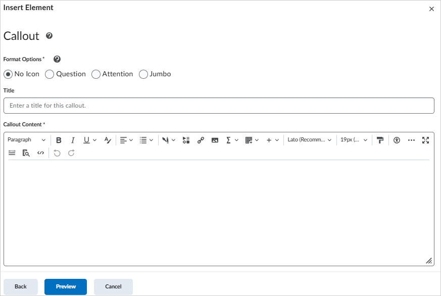
- To set the display style, select one of the Format Options.
- To add callout content, enter a Title and Callout Content.
- To add another callout, click Back, and then add another element.
- To review and add the element, click Preview, and then click Insert.
The Callout element is added to your content.
Insert a timeline
Use Insert Element to add Timeline elements to your content. A timeline is useful for presenting events over time, the steps in a process, or items in a series. You can also use a timeline to show two sides of a conversation.
To insert a timeline
- In the Content tool, create a new topic or edit an existing topic.
- Click Creator+ Authoring Tools, and then select Insert Element.
- Click Timeline.
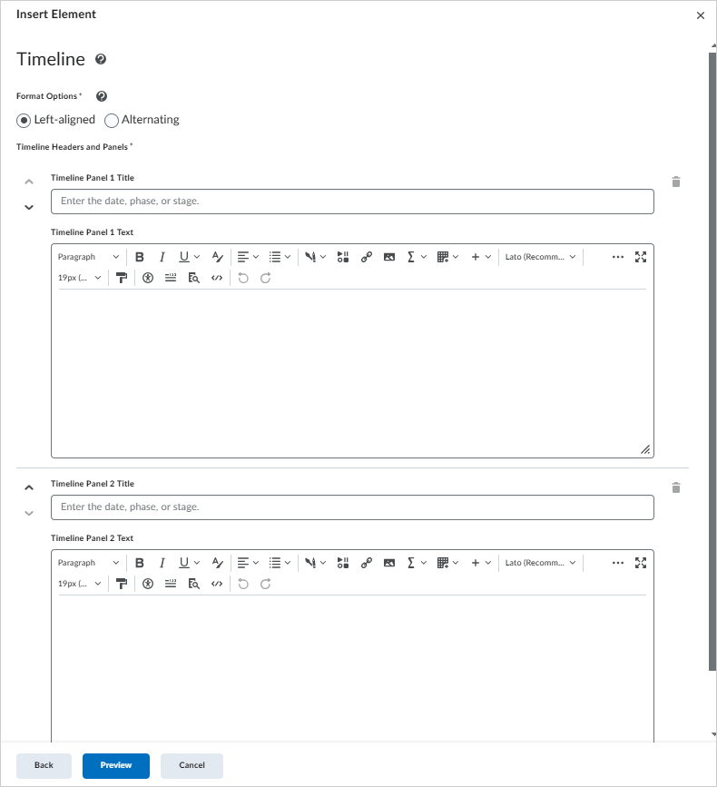
- To set the display style, select one of the Format Options.
- To add the first entry, enter a Timeline Panel Title and Timeline Panel Text.
- To add another timeline panel, click Add Item.
- To review and add the element, click Preview, and then click Insert.
The Timeline element is added to your content.
Video: Creating Timelines with Creator+
Insert a stylized quote
Use Insert Element to add Stylized Quote elements to your content. A stylized quote uses large quotation marks and color to distinguish quoted content from the surrounding content.
To insert a stylized quote
- In the Content tool, create a new topic or edit an existing topic.
- Click Creator+ Authoring Tools, and then select Insert Element.
- Click Stylized Quote.
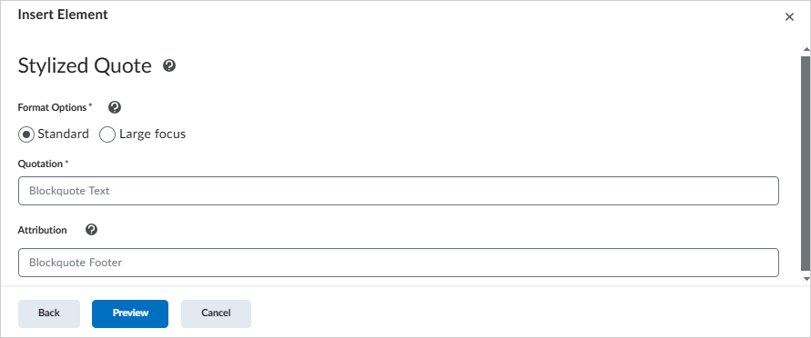
- To set the display style, select one of the Format Options.
- To add the quote, enter the Quotation and Attribution.
- To review and add the element, click Preview, and then click Insert.
The Stylized Quote element is added to your content.
Insert flip cards
Use Insert Element to add Flip Cards to your content. Flip cards are useful when you want to present a group of related items that do not need to follow a specific sequence. They are especially effective when you include images.
To insert flip cards
- In the Content tool, create a new topic or edit an existing topic.
- Click Creator+ Authoring Tools, and then select Insert Element.
- Click Flip Cards.
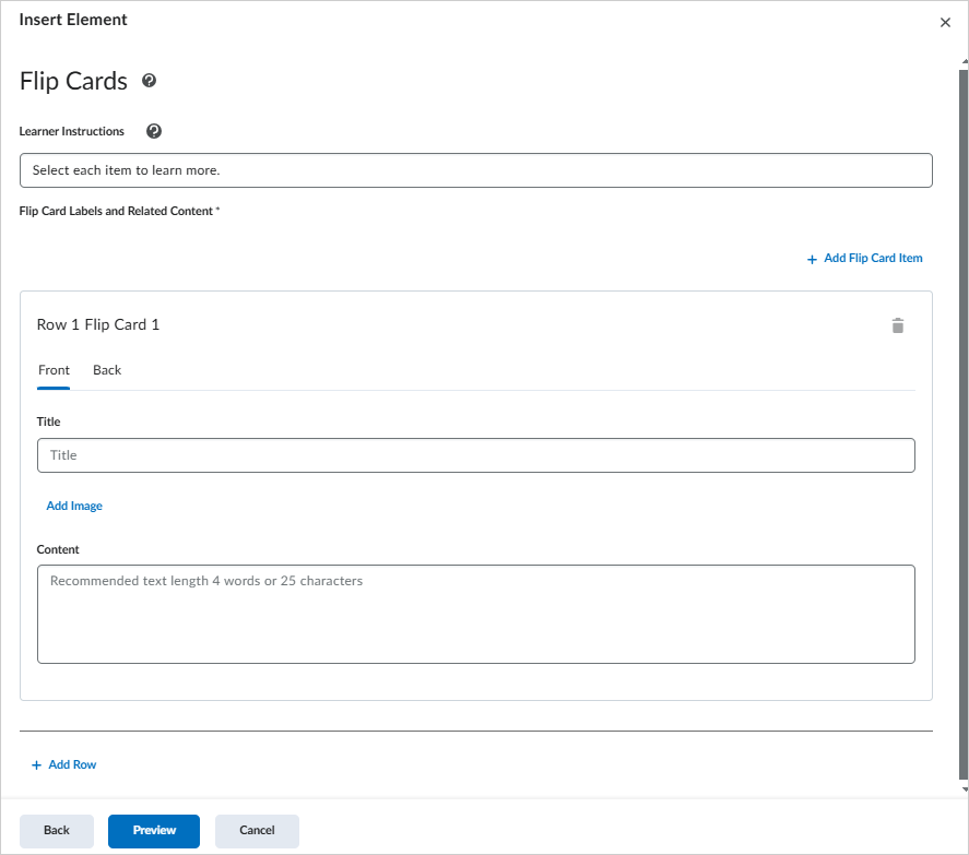
- To help learners use the element, enter text in Learner Instructions.
- To add front-side content, on the Front tab, enter a Title.
- To add an image to the front of the card, click Add Image.
- To define the image, select an image file, and then add Alternative Text or indicate that the image is decorative.
- To save the image, click Save.
- To complete the front of the card, enter text in Content.
- To add back-side content, repeat the process on the Back tab.
- To add another card on the same row, click Add Item.
- To add another row of cards, click Add Row.
- To review and add the element, click Preview, and then click Insert.
The Flip Card element is added to your content.
|
Note: For best results, keep image content to 4 words or 25 characters or fewer. |
Insert carousels
Use Insert Element to add Carousels to your content. A carousel is a slideshow of images and text. Learners view one slide at a time and move through the slides in sequence. Carousels are useful for presenting the steps in a process or a set of related items.
To insert a carousel
- In the Content tool, create a new topic or edit an existing topic.
- Click Creator+ Authoring Tools, and then select Insert Element.
- Click Carousel.
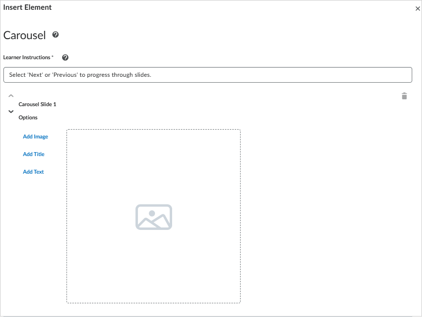
Figure: Select Carousel in the Insert Element dialog.
- To help learners use the element, enter text in Learner Instructions.
- To configure the first slide, click Add Image, Add Title, or Add Text.
- To add another slide, click Add Slide.
- To review and add the element, click Preview, and then click Insert.
The Carousel element is added to your content.
Insert a hotspot element
Use Hotspot to create an interactive image with selectable markers that reveal additional information. Hotspots support exploration-based learning and can include accessible micro alt tags for image regions.
To add hotspot markers to an image
- In the Content tool, create a new topic or edit an existing topic.
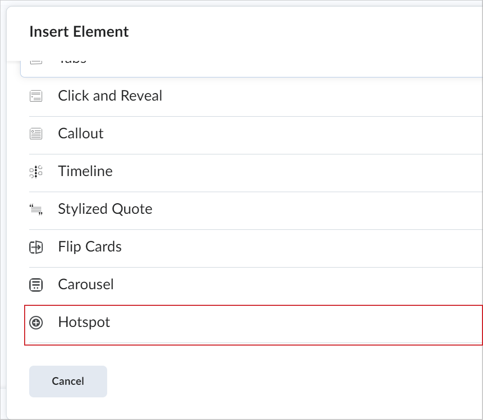
- Click Creator+ Authoring Tools, and then select Insert Element.
- Click Hotspot.
- To define instructions for learners, keep the default Learner Instructions or enter custom instructions.
- To add an image, click Add Image, select an image from your device, and then enter text in the Alternative Text field.
- To save the image, click Save.
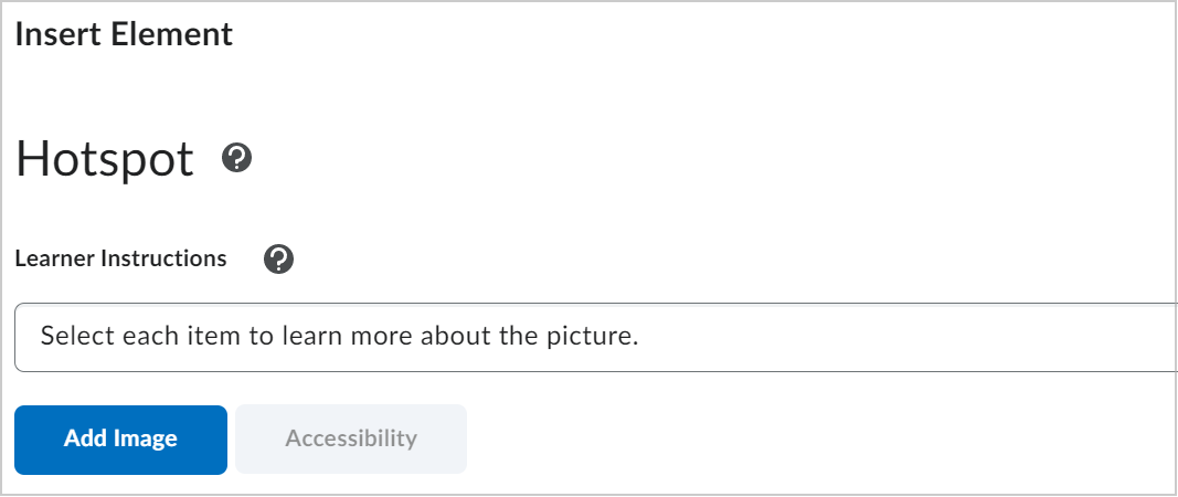
Figure: Add an image in the Insert Element dialog.
|
Note: The Hotspot element currently supports JPG and PNG image files only. AVIF images are not supported. |
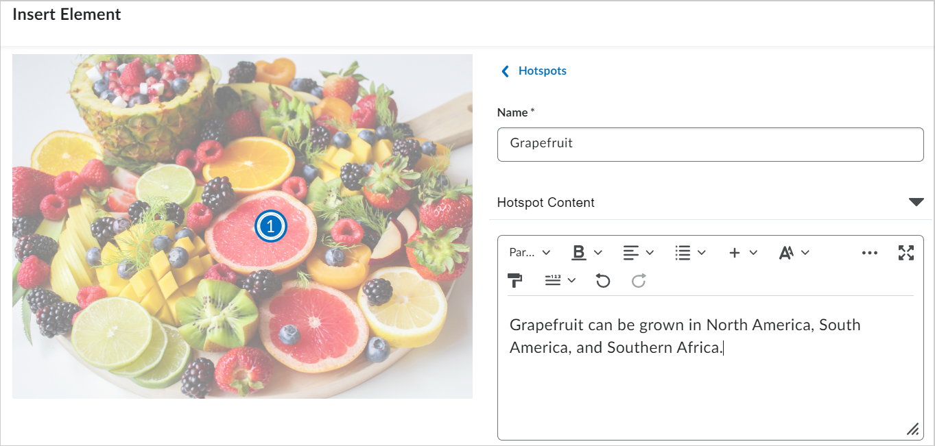
- To place a hotspot marker, click anywhere on the image.
- To edit a hotspot, in the right panel, select the hotspot you want to update.
- To identify the hotspot for authors and screen reader users, enter a name in the hotspot name field.
- To add hotspot details, in Hotspot Content, enter a description or add supporting content such as images, videos, and links.
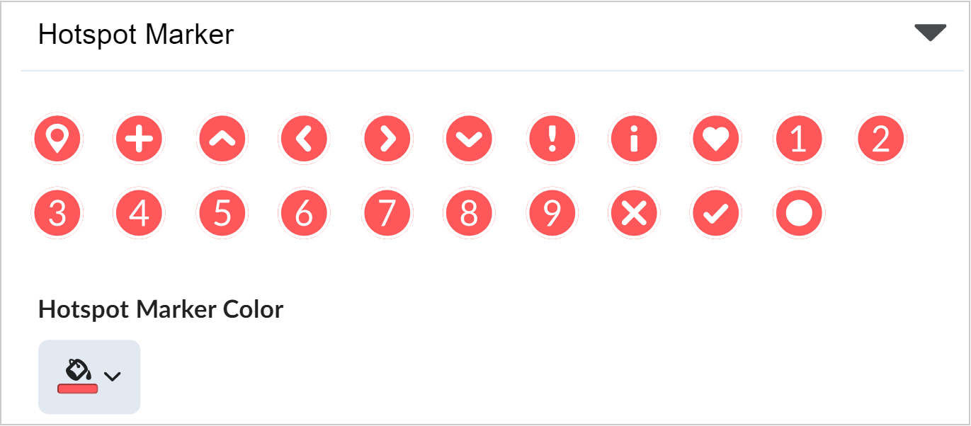
- To change the appearance of a hotspot marker, click Hotspot Marker, and then select an icon and color.
- To add more hotspots, click Hotspots, and then repeat steps 6 to 10.
|
Note: You can insert up to nine hotspot markers for an image. |
- To configure accessibility, below Learner Instructions, click Accessibility.
- To choose an accessibility option, under Accessibility, do one of the following:
- Select Accessible hotspots only to add a micro alt tag for each hotspot.
- Select Fully accessible image to divide the image into a grid and add a micro alt tag for each cell.
- To complete accessibility setup, add the required micro alt tags based on your selection.
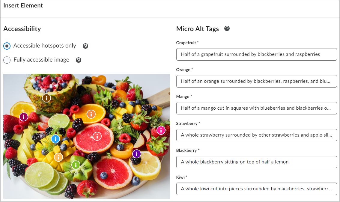
Figure: Add Micro Alt Tags for hotspots or image grid areas.
- To add the hotspot to the content topic, click Save and Insert.
- To finish editing the topic, click Save and Close.
You have created a Hotspot element.
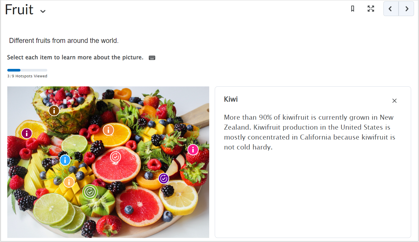
Figure: A Hotspot element in Content.
Video: Create content with the Hotspot Element
Edit an inserted element
To edit an inserted element
- In Brightspace Editor, click the element you added.
- To open the editing interface, click Edit using the icon at the top of the element.
- To move or remove the element, use the options in the same panel to move the object up or down, or delete it.
If the element is the first object on the page, the edit panel appears below the object.
|
Note: You can edit some aspects of elements using the code editor; however, you cannot directly edit inserted elements outside the Insert Element edit workflow in the WYSIWYG interface. |