Comment re status colours on PIE

Have I just not noticed the colours on the PIE before? This is how “Status” colours are currently allocated:

I would say there are some colour choice problems and suggest the following changes:
• “Not Planned” should definitely not (a) be green and (b) be the same colour as “In Planning”. Make it red like “Closed”.
• “Released” should be green.
• “In Review” and “Feedback Review Window” should both be yellow
• “Duplicates” should be grey.
You might also want to make them match the colours on this "D2L Product Idea Exchange Statuses" page.
Finally, someone needs to revisit the (partial) menu of “Status” items on the PIE home page. The results they produce when selected are either inconsistent or null. This includes: “Gathering Feedback”, “New”, “In Development”, “Partial Release”, and “Gathering Feedback”.
Tags: UX, User Experience, User Design
Answers
-
Thank you so much for your feedback! We made some updates which should help make these status<>color mappings more intuitive.
-
Thanks for the quick turnaround @Tommy.O.141! A definite improvement!
Icing on the cake might be adding the colours on the "Status" page:
Before
After

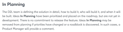
And in the diagram at the bottom of the page.

