Tweak UX when creating New Forum

I don't think it constitutes a PIE item but, could the UX Team to take a look at what happens when you click "New Forum" in the "New Category" interface? A little tweak would improve the user's experience of the tool. (see video)
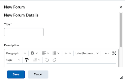
This is what the pop-up window looks like when it loads:

This is what it could look like:

Tags: UX, User Experience
Answers
-
On a related note, there seem to be two different but parallel Forum and Topic creation workflows on the platform at the same time.
If I create a Forum from scratch using Discussions - New Forum or New Topic, I see this:


Whereas, if I create a new Forum as part of the create Groups workflow, I see what I think is a vestigial workflow that needs to be updated:

-
Also on the topic of Discussion forums, there is a problem with font size in the subtitles of posts:

Tags: UX, User Experience
-
Nope…even without the UserID, there is still a formatting problem:
(in student view)

-
Hi Mike,
Thank you for the details you provided, and appreciate your time.
For issues 1 and 2, let me engage the internal team for this.
For issue # 3, "topic of Discussion forums, there is a problem with font size in the subtitles of posts",
Can you create a support case and provide a detailed example? Someone will look into this issue with you.
Thank you -
Thanks @Furkan.K.312 .
Re #3, something appears to have changed since yesterday. I am unable to replicate the display issue. It seems like yesterday, after the word count it was showing the discussion forum group where a post was posted. Today, it does not. I don't think I changed a setting…but maybe.

-
Hi @Mike.B.559
Some great points here.
We've passed these points along to our Product Team for their review and awareness.
they've shared back with us that for now, the truncated view of the window which appears when a user selects “New Forum” in the “New Category” interface is considered expected behaviour.
This is also true of the different UIs presented for the Discussion creation workflows at the moment.
We are working to expand the workflows that use new discussion layout and will continue to update the Product Roadmap and Release Notes with our progress there.
Some of the most recent efforts to bring greater uniformity to the discussion layout view is note in this article on the new display pages for assessable activities in the New Content Experience. -
Thanks for sending this along. That final link clarifies the underlying rationale. Two comments on this switch from Classic to New. One, rather than reading about what the New Content Experience is going to look like, I would have preferred see the interface demonstrated as a narrated screencast The screenshots are useful, but seeing it in action would have been easier to understand. And two, I would have recommended calling this "New" version something different and novel…like the "Daylight" user interface. Calling it "New", kind of limits future versioning. The next iteration can't be called "New new".
-
Re my comment about the truncated view, my preference as a user is that when a window appears as a popup, it should be ready to go. As it stands, each time that truncated view loads, it's up to the user to drag a corner before they can add text to it. Why not have that "Description" field showing so the user can just type directly into it?
-
@Furkan.K.312 Hi again, Re #3 above. Turns out I was able to replicate the font size/wrapping problem I had earlier. It occurs when an instructor is grading a submitted post from a student. This is what it looks like:

As for creating a support request, I'm not reporting it because I need it fixed. I'm reporting it because it appears to be a bug in the UX that needs to be addressed.
-
Just wanted to follow up to let you know @Mike.B.559 that I have share the screen shot and notes here with the product team for their review and with your account team for their awareness of the UX concern.
Appreciate you taking the time to provide this detail and screen shot.


