How to reduce the darkening of banners

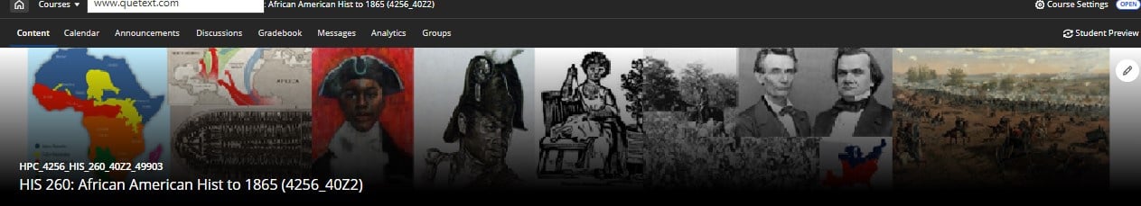
I spent a lot of time constructing banners with images relevant to my courses. The darkening covers almost the entire banner, obscuring my efforts to visually stimulate and engage learners. I have to question whether techies who impose these kinds of changes actually consult educators. The darkening should at least be adjustable to the area of text imposed. My message: please consider carefully how students experience learning. Find solutions that work for all students, disabled or not.
Answers
-
Hi, @William.B.467.
My guess is that this was actually an artistic decision made by visual designers (and implemented by the techies at their request), with the goal of making the image choices provided natively within Brightspace the most effective (shadow/shading to add depth). I can see how it doesn't work well at all with your own banner, though.
Have you reached out to your Brightspace site administrator? If they can't find a solution for you, they can post a question in the ASC Support Portal to see if D2L has a workaround to propose. I think it's worth asking this question through more effectual channels than just the Community's "ask a question" mechanism.
Just my 2 cents. Hope it's helpful in some way.
